
| |
|
#211
 03-08-2011, 09:33 AM
|
||||
|
||||

I laughed so hard my wife ran in. I mean so....."Look at me......I'm Stevie Nicks....I'm enchanted....um...did I mention I'm Stevie Nicks?"
 Having said that....I love it. Having said that....I love it. Mick
__________________
The large print giveth And the small print taketh away -Tom Waits 
|
|
#212
03-08-2011, 09:39 AM
|
||||
|
||||
|
Having never met her, I'm still willing to bet that the real-life Stevie Nicks looks good for her age.
There is nothing shameful, halfhearted, euphemistic or rude about saying that someone looks good for their age. 'They' (and she's allowing it) have made her look ridiculous, and ensured that instead of talking about the music and how it's great that she's still a productive artist, we're forced to talk about (im)age. Depressing.
|
|
#213
03-08-2011, 09:43 AM
|
|||
|
|||
|
Quote:
I can see that connection. I loved that movie (except for Tom Cruise being in it, wasn't he awful?). My first thought was Rhiannon. This is similar to what I was picturing for a cover when she was talking about making a whole Rhiannon cd someday. The other thing was how it is made to look like a very young and innocent Stevie from the past. Then noticing her moon necklace in the photo - was it reversed imaging, or did they purposely want to have the moon be in the waxing stage, to represent the young, maiden Stevie?? Did she ever wear it like that when she was younger (I don't even remember)? I like it. Wouldn't it be nice for a gorgeous, picture-filled tour book too this time?
|
|
#215
03-08-2011, 10:42 AM
|
||||
|
||||
|
I am so glad that 85 percent of the ledge seems to like to cover. It reminds me of lord of the rings, Labyrinth, and yes Louie LEDGEND. I agree with the people who said it is meant to look good on an album cover, or a thumbnail on itunes not blown up to five times its size and over analyzed. But as usual the same people who are never happy with anything. Have turned something really exciting into yet one more reason to complain.
__________________
|
|
#216
03-08-2011, 10:50 AM
|
|||
|
|||
|
I love this magical album cover! I am so happy with it!

|
|
#217
03-08-2011, 10:52 AM
|
||||
|
||||

Quote:
Again it also makes me think of arawyn from lord of the rings. BEAUTIFULL. so very RHIANNON. The album is called in your dreams not cold harsh reality
__________________
|
|
#218
03-08-2011, 10:54 AM
|
||||
|
||||
|
Well, I really don't want to complain. And I noticed something was "off" with the face before I zoomed in on it. The asymmetry bugs me because she's so pretty. It's like, why did they have to mess with it? But I'm going to go ahead with the thought that some of you have mentioned - that they distorted it on purpose for a dreamy look.
__________________

|
|
#219
03-08-2011, 11:23 AM
|
||||
|
||||
|
According to Dave, the reason Stevie's face looks that way is because of the bubble effect:
@DaveStewart "Stevie's album conver looks great and I loved the idea w. the horse & forest& glem of light but her face looks too touched up." about 4 hours ago via txt @GoldAndBraid "it's not actually it was just a weird freak of that bubble effect around her !" about 4 hours ago via web in reply to GoldAndBraid http://twitter.com/DaveStewart/status/45101541903962112
|
|
#220
03-08-2011, 11:39 AM
|
||||
|
||||
|
Hate it.
 Seriously. I laughed when I saw it - literally lol'd. I'll be a little embarrassed to show this to people. It's cheesy & silly, and there's a random f*cking white HORSE there. WTF?! Really? Ugh. One more thing to force people NOT take her seriously. Seriously. I laughed when I saw it - literally lol'd. I'll be a little embarrassed to show this to people. It's cheesy & silly, and there's a random f*cking white HORSE there. WTF?! Really? Ugh. One more thing to force people NOT take her seriously.  Sorry guys, I just feel that it's really, really REALLY awful.
|
|
#221
03-08-2011, 11:40 AM
|
||||
|
||||
|
The more I look at it, the more I like it. If they were going for the bubble effect, I just wish it was more centered or something....just off a little bit.
I am looking forward to the outtakes from this session, though.
__________________
Curtis
|
|
#222
03-08-2011, 11:43 AM
|
||||
|
||||
|
I love it so much. Stevie, a forest, a horse.. and that DRESS. Her bare shoulders are so provocative I might shed a little tear.
|
|
#223
03-08-2011, 12:12 PM
|
||||
|
||||
|
Quote:
|
|
#224
03-08-2011, 12:13 PM
|
||||
|
||||
|
Quote:
|
|
#225
03-08-2011, 12:20 PM
|
|||
|
|||
|
Quote:
The Secret Love single cover was much better.
|
 |
|
|


Billy Burnette - Try Me Vinyl LP MCA-27114 (1985, MCA / Curb Records) SEALED
$9.88
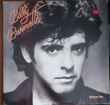
BILLY BURNETTE - GIMME YOU - 1981 COLUMBIA RECORDS VINYL ALBUM - (VG/VG+)
$5.00
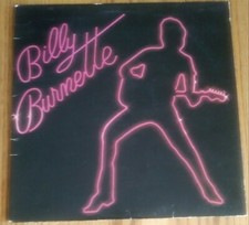
BILLY BURNETTE - (SELF-TITLED) - 1980 COLUMBIA VINYL RECORD - (VG/VG)
$4.50
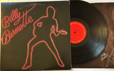
Billy Burnette - Self-Titled LP - 1980 1st Pressing 12" Columbia LP + Lyrics VG+
$4.50
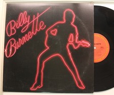
Billy Burnette Lp Self Titled On Columbia - Vg+ To Vg++ / Vg++
$11.99


 Better than I could have ever hoped for! Very evocative of the '80s movie Legend


 Linear Mode

