
| |
|
|||||||
| View Poll Results: favorite album cover | |||
| Bella Donna |
   
|
18 | 21.69% |
| The Wild Heart |
  
|
19 | 22.89% |
| Rock a Little |
  
|
13 | 15.66% |
| The Otherside of the Mirror |
  
|
2 | 2.41% |
| Street Angel |
  
|
3 | 3.61% |
| Trouble in Shangri-la |
  
|
28 | 33.73% |
| Voters: 83. You may not vote on this poll | |||
 |
|
|
Thread Tools | Display Modes |
|
#33
 12-04-2010, 09:31 AM
|
||||
|
||||

Bella Donna - Iconic image, powerful, simplistic, beautiful.
Wild Heart - Love the purply/pink colours, and how Stevie seems to be coming out of the darkness. Rock A Little - She looks so skinny here, such a contrast with Wild Heart; Stevie at the height of her "witchyness" OSOTM - I like the concept. However, her hair ruins the whole thing and makes her look cheap. Hair is that important to me  Timespace - Hideous. I don't like it at all. Street Angel - It's a massive pink BLOB (she blends in with the background awfully) with blonde hair. Looks awful and cheap. Not arty at all. the font is hideous. TISL - Lovely. Captures Stevie at her most mystical. Love her wearing pink! The fonts used are gorgeous as well. Crystal Visions - Love that photo of Stevie, her hat is TOO cute. Gotta go with Wild Heart though. Bella Donna and TISL are very very close.
__________________
 
|
|
#34
12-04-2010, 11:17 AM
|
||||
|
||||
|
Quote:
__________________

|
|
#35
12-04-2010, 02:30 PM
|
||||
|
||||
|
I don't go in for the pink-powder-puff mysticism on Stevie. I go for the hard-rawkin' mysticism of her younger days. So I like the Bella Donna front cover because that's the gal who rawks it. The only problem is the back cover, where Stevie looks Mongoloid. But redemption comes on the inside sleeve photo, with the rich woods & tapestries & the three hip ladies draping their thin, sleek bodies over the furniture & beckoning all to enter their dark realm.
On the second album, it looks like "Dumb & Dumber & Dumbest." Bad photography on her ol' face there--she looks like a psych ward patient. Plus, you can't even see the cool black cape with the hood because the backdrop is so dark. That was dumb--look at how beautifully lighted Worthington's covers are for Fleetwood Mac. The backdrops are bright & nondescript. You don't even notice them; your gaze is drawn right to the figures up front. Inside sleeve photos are quite nice, but it's a shame Sandy Stewart is in them. She doesn't get it. She probably thought that if you just look pouty & stupid, you can capture Stevie's or Sharon's aura. On the third album, Stevie looks like a kewpie doll on a stick on the front cover. I really miss not having that chilling black cradle & its matching rocking chair. I don't even remember what's on the back cover. The fourth album is grotesque. Did Worthington consult with a 12-year-old Stevie Nicks fan? Did he ask some poetic-minded but illiterate young chit in junior high school, "How do you see Stevie?"? But I guess it goes with the crap on the album. It may be Stevie's most perfect amalgamation of shlock form & shlock content--true shlock art. The fifth album--which one is that? I don't even remember. Timespace? Garish & female impersonatorish. These were Stevie's tackiest years. She seemed to be punishing herself for having grown so big & stodgy. She wallowed in her grotesquerie. (Think of the stupidly zonked way she replied to Jim Ladd backstage at the Whiskey in 1991: "Let me go--let me GO--LET ME GO!!" What a far cry from the totally hip rock babe of 1977.) The sixth album . . . I'm lost. Street Angel? Powder-puff shlock all around. Bummer, too, because the music was back to being pretty good, & the live singing was certainly a hundred times better than it had been for about eight years. The seventh album, Trouble in Shangri-La. Dumb dumb dumb, but at least it was carefully produced, with a hint of the old professionalism. Still, the ass is too fat on the front cover, & there is just too much of that calligraphy & all those dragons & twirlies & doilies & ****. Stevie's fans wouldn't know true mysticism (like the great German Romantic Novalis) if it bit them in the ass. But that's neither here nor there. Has there been another album? I don't think so, right? No more covers to judge ... yet.
__________________
 moviekinks.blogspot.com Last edited by David; 12-04-2010 at 02:32 PM..
|
|
#36
12-04-2010, 02:55 PM
|
||||
|
||||
|
Quote:
__________________
 You were the only audience I ever needed. Last edited by Silver Springs; 12-04-2010 at 02:57 PM..
|
|
#37
12-04-2010, 03:25 PM
|
|||
|
|||
|
Stevie and her Image
The album covers have been build to focus on her persona, not her as a person. In fact, her entire public career is "conceived" to be this mystical goddess. Of course, her music is from the heart, and gave fuel to her whole image.
Having known many in the biz (but not her), I'd say the SA cover is closest to herself than any of the others. But that cover is really bland and the typography just awful. I actually didn't even care for the title either. It's way too "Dickerson" for a pop/rock album, unlike "Bella Donna" or "Wild Heart" which really conjures up a free spirit that is more associated with her type of rock music. Any ideas or suggestions for the name of the new CD???
|
|
#38
12-04-2010, 03:28 PM
|
||||
|
||||
|
Quote:

__________________
You were the only audience I ever needed.
|
|
#39
12-04-2010, 03:38 PM
|
||||
|
||||
|
Quote:
Quote:
Quote:
__________________
moviekinks.blogspot.com
|
|
#40
12-04-2010, 03:45 PM
|
||||
|
||||
|
Quote:
__________________
You were the only audience I ever needed.
|
|
#41
12-04-2010, 04:46 PM
|
|||
|
|||
|
Bella Donna - I remember being a kid and my Dad had this album. I remember staring at it and figuring out what it all meant; the cockatoo, the tambourine w/ white roses and the typeface. Fascinating. I also loved her ass in he pic...but never listened to the album till a few years later. I voted for this album cover as the best.
The Wild Heart - First Nicks album I bought and second runner up. Learned years from HWIII what it all meant. Neat. Rock A Little - It's not bad, I like the energy in it. Wish the album matched the energy of the cover. The Other Side of The Mirror - I wished they used the back cover photo. That picture depicts the music and slow haze of the album as a whole much better. Street Angel - Bare bones and lackluster. I don't mind the actual photo, but the design is amateurish. Trouble In Shangri La - It's dumb. I also do not like the backside of anyone on an album cover. And as David mentioned, the ass is rather big. Last edited by Richard B; 12-04-2010 at 04:47 PM.. Reason: Typo
|
|
#42
12-04-2010, 06:37 PM
|
||||
|
||||
|
I voted for RAL. I like that it looks as if the camera shoots her mid-twirl while she glances up from under the hat. Captures some of the spontaneity that was so great about Stevie during the period. The purple ball & title font are a little cheesy, but I really like the photo.
Second place for me is BD. I like the way her back, arm, & shoulder look. Back in the day, every teen-aged guy I knew thought that if you angled the photo just right, you might get a peep through the fabric hanging off her arm.  The only part of TWH cover that I like is the standing Stevie with crossed arms. That by itself would have been a great cover. The floor Stevie is my least favorite, & the middle Stevie makes the whole photo look like it's made with these, if anybody else is old enough to remember: http://en.wikipedia.org/wiki/Colorforms I can't stand TOSOTM cover. The odd body pose can perhaps be forgiven, but her mouth looks like this: http://en.wikipedia.org/wiki/Wax_lips It's as though her lips are even more posed than the rest of her. As for the awful SA cover, that no-neck pic with arms folded makes her look like she wants a part in "Les Miserables". I do not care for the TISL cover. I think it might be okay if it were just the same Stevie pic, but against a stark background, like on RAL. All the other crap around her looks like a cheap spa ad to me. No offense to all the people who like it. - Jake
|
|
#43
12-04-2010, 07:14 PM
|
||||
|
||||
|
I love the crystal ball on the RAL cover. It added to the witchiness.
__________________
|
|
|
|

![Christine McVie - Christine Mcvie [New CD] picture](/vintage/img/g/2jkAAeSwFlFpHc17/s-l225/Christine-McVie-Christine-Mcvie-New-CD-.jpg)
Christine McVie - Christine Mcvie [New CD]
$17.25

Christine McVie – Christine McVie (CD, 2023)
$12.00
![Christine McVie - In The Meantime [New CD] picture](/vintage/img/g/nRIAAeSwBM9pHfKK/s-l225/Christine-McVie-In-The-Meantime-New-CD-.jpg)
Christine McVie - In The Meantime [New CD]
$17.25
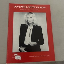
CHRISTINE McVIE "LOVE WILL SHOW US HOW" Sheet Music P/V/G 1984 Unused
$18.00
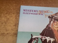
christine mcvie hand signed 1970s excellent Fleetwood Mac – Mystery To Me lp33
$272.11





 Linear Mode

