
| |
|
|||||||
 |
|
|
Thread Tools | Display Modes |
|
#1
 07-22-2010, 09:45 AM |
||||
|
||||
 Bella Donna - Should Stevie have flipped the artwork? Hi guys,
I'm just listening to my copy of the new Sheryl Crow record and I immediately thought that the picture on the back cover is far better than the one she chose for the front! It's a really nice picture of her that i think sums up the positive mood of the album... Anyway, this reminded me that I always meant to post a similar thought on here about Bella Donna. I've always loved the image on the back with Stevie looking through the tambourine (especially when seen in full sized glory on vinyl) but never been too keen on the front cover. It's a great shot, whereas I'm just not too keen on the cover one. Does anyone else think the back image should have been on the front and vice-versa? I really think it works better as a cover shot, with Stevie gazing at us and inviting us "in" to the album, as shows by the "come in.. out of the darkness" text that goes alongside it. So I get why those two things are placed together but I stull think it would have been great if that image was on the front, with the "come in..." text on the back alongside what became the front cover. Anyone agree or have I just offended you all?!
__________________
I'll follow you down until the sound of my voice will haunt you...you'll never get away from the sound of the woman that loves you... 
|
| . |
|
#2
07-22-2010, 10:33 AM
|
||||
|
||||
|
Well it's funny that you like the back cover of the Sheryl Crow CD more than the front because the back picture is more of a full body shot, which is what Stevie did for all of her CDs in the 80's, the full body shots. I too love the back pic on the Bella Donna album but I do think the front pic is more of an iconic picture of Stevie. Using the back pic as the front would then throw off the consistency for the rest of the 1980's releases, in my opinion.
|
|
#3
07-22-2010, 01:17 PM
|
||||
|
||||
|
Well if she flipped them the concept for the covers would have been lost. The idea being that she has just picked up the tambourine and is looking thru it, coming in out of the darkness. The music inside is what she is seeing.
Ahh back to the days when album covers were part of the album's concept and not just a photo slapped on the front.
|
|
#4
07-22-2010, 02:53 PM
|
|||
|
|||
|
Quote:
but I agree w/ the above comment as well....
__________________
  Love is a word that some entertain, If you find it, you have won the game...
|
|
#5
07-22-2010, 02:56 PM
|
||||
|
||||
|
I've never cared for the tambo photo for whatever reason. Like Travis said, the cover pic of her in the dripping chiffon holding Max the cockatoo is just iconic. To me, it says more about who she is and what her persona is than the tambo pic.
|
|
#6
07-22-2010, 05:16 PM
|
||||
|
||||
|
Quote:
__________________
I'll follow you down until the sound of my voice will haunt you...you'll never get away from the sound of the woman that loves you...
|
|
#7
07-22-2010, 06:08 PM
|
||||
|
||||
|
Quote:

|
|
#8
07-22-2010, 07:01 PM
|
||||
|
||||
|
I've been called worse - including a ass several times! Haha. Butt yes, you're right...
__________________
I'll follow you down until the sound of my voice will haunt you...you'll never get away from the sound of the woman that loves you...
|
|
#9
07-22-2010, 07:12 PM
|
||||
|
||||
|
Quote:
__________________
Much Love 
|
|
#10
07-22-2010, 07:27 PM
|
|||
|
|||
|
Fascinating to me that others have 'flipped' the photos in the cd to make a cover they prefer. I did it 8 years ago with 'TISL' making the inside pic of her in the black dress with the Asian writing my 'cover' photo of the cd, and never changed it back, I like it much better! Though, I 'get' the essence of 'running away' or 'escaping' Shangri La, and that's why she chose the cover shot that she did.
I LIKE dodfather's idea about the back of 'BD' being the front cover, I think it would work really well. The REALLY bad mistake (worst ever?) made was the cover of 'Enchanted'-- granted, it was about her writing and her voice, but to have such an iconic star's box set have an effing feather on the cover was just too lame. I always thought 'Enchanted' would have sold even better than it had, if a killer shot of Stevie had been on the cover of the box set. It was such a missed opportunity, but I think maybe it may have been that Stevie was trying to distance her image from her 'prettiness' so she put the plain feather on the cover, or quill, with her signature. At the time, I thought she must have wanted the emphasis to be on all of the music she'd written inside the box set... but a freakin' feather for the cover?! Then, 'Sable On Blonde' wasn't even included, which, at least, has a freakin' feather mentioned in the song!! Madness. Just madness.  If people like your physical presentation and had been buying it for decades- Use what ya got! Yes, I know CN was the 'art director' of that cd, but SN approved the cover. Besides, I think all the brother bashing wouldn't go over with Her Stevieness Not a bit. Nice brother, good brother, uhh... talented brother. But what a bad cover for the boxset!! Last edited by Nikolaj; 07-22-2010 at 07:59 PM..
|
|
#11
07-22-2010, 07:27 PM
|
||||
|
||||
|
Never thought about it before, but looking at my vinyl now, I agree. brb, photoshop.
|
|
#12
07-22-2010, 07:44 PM
|
|||
|
|||
|
[QUOTE=skuncles;901631]Well if she flipped them the concept for the covers would have been lost. The idea being that she has just picked up the tambourine and is looking thru it, coming in out of the darkness. The music inside is what she is seeing.
Well, couldn't she just as easily be looking through the tambourine from the front cover as from the back of an album? I mean, if one could see through a tambo and cardboard, couldn't she as easily have made it the front cover and not ruined her concept? Edit: I guess the back photo would need to be rotated, so she'd been looking back, and not out! Okay, I get it now.. And seeing how the white-winged cockatoo is the first song on Side 2, I think it makes more sense to have the photo with the bird on the back side of the album, not the cover! And 'come in out of the darkness' is track one on Side One, so the back cover sort of makes more sense as the front cover! Dodfather may be on to something, here. Nearly thirty years on... Boy, are we hungry for new Stevie music to be giving this such thought, now!~ Last edited by Nikolaj; 07-22-2010 at 08:19 PM..
|
|
#13
07-22-2010, 08:05 PM
|
||||
|
||||
|
This is a little uneven because I couldn't find good copies of either picture, buuuut.

|
|
|
|

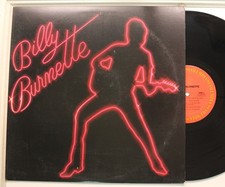
Billy Burnette Lp Self Titled On Columbia - Vg+ To Vg++ / Vg++
$11.99
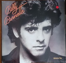
BILLY BURNETTE - GIMME YOU - 1981 COLUMBIA RECORDS VINYL ALBUM - (VG/VG+)
$5.00
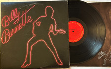
Billy Burnette - Self-Titled LP - 1980 1st Pressing 12" Columbia LP + Lyrics VG+
$7.50
BILLY BURNETTE - (SELF- TITLED) - 1979 POLYDOR RECORDS PROMO VINYL LP - (VG/VG)
$5.50

Billy Burnette - Try Me Vinyl LP MCA-27114 (1985, MCA / Curb Records) SEALED
$9.88


 Linear Mode


