
| |
|
#7
 08-20-2015, 03:43 PM
|
||||
|
||||

Since this thread is generally about Stevie's album covers I want to count all of them:
11) 1998 – The Enchanted Works of Stevie Nicks  Just one word: lazy. I like minimalism but seriously, does this looks like the summary of a majestic music career? Even if it's a greatest hits they should have at least put some effort in it. 10) 2007 – Crystal Visions - The Very Best of Stevie Nicks  Now this is more like it. Simple but not simplistic. Some beautiful pictures of a beautiful Stevie from a beautiful photoshoot. Simple, nice and delicate style for the font, that reminds me a bit of art nouveau. But that's about all. 9) The Other Side of the Mirror  What happened to her face? And to her arms? The concept and the colors are beautiful but everything has been ruined by the gross editing on her appearance, that in my opinion was really unnecessary to begin with but turned out damaging. For all this reasons added to the one that the pose is a bit predictable, I've always thought that the back picture would have been an amazing cover for this album instead. 8) Timespace - The Best of Stevie Nicks  This is actually nice even if it's nothing special. I love Stevie with darker hair and the vivid and higly saturated colors are very Pop-Art/Andy Wharol style. 7) Street Angel  Again I think that this is actually nice. Simple, minimalist and refined in its light colors, it fits well with the down-to-earth nature of this album. Actually the picture is better than the album itself. 6) In Your Dreams  This cover is very pretty. You can see that it's been thought and there's a sort of concept behind it; Stevie's vintage gown, the white horse, the forest, the light filtering through the foliage: indeed everything looks "dreamy". The only thing that bugs me is that the editing of the foto looks a bit unnatural. 5) Rock a Little  Again with the vintage allure, but this time it worked magnificently. The high contrast Black-White-Red color scheme resembles the one of The Other Side of the Mirror but here the colors are more pure and regal, and the contrasts are essential. 4) Trouble in Shangri-La  This cover is beautiful. The colors are honeyed, like veiled by a suffused gold light and the image of Stevie against the ocean is evocative. The oriental details reminding of the album title looks like they are finely watercoloured. This truly looks like a triumphant comeback. 3) 24 Karat Gold: Songs from the Vault  Everything I've said for Trouble in Shangri-La can be said for this album cover too. The colors are subdued, soft and golden. Stevie is gorgeus. It's mystical, retrò, peculiar. I've been delighted to find out that she had this hidden talent for photography and this cover is the proof. 2) The Wild Heart  This cover use such a strong imagery that seems to jump right out from the subconscious. While the images are amazing and dreamlike, the colors are intense, sumptuous, rich of mysterious shadows. 1) Bella Donna If I had to describe this cover with just one word, it would be simply "iconic". The colors are fine, ethereal and delicate, emphasized by the stark contrast with the darkness of the background, and Stevie is the image of daintiness and femininity. It represents perfectly the statement: "Come in out of the darkness". Last edited by SisterNightroad; 08-20-2015 at 03:53 PM.. 
|
|
|

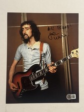
JOHN MCVIE HAND SIGNED 8x10 PHOTO AUTOGRAPHED FLEETWOOD MAC BASSIST RARE BAS COA
$127.49
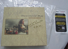
FLEETWOOD MAC MIC,JOHN MCVIE,BURNETTE BEHIND MASK AUTOGRAPHED JSA COA Nm/Nm A05
$128.99
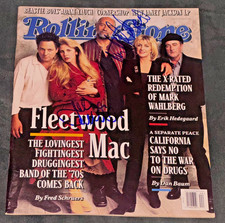
Signed John McVie Mick Fleetwood Mac Autographed Rolling Stone Magazine Auto PSA
$499.99

Mick Fleetwood John McVie autographed Fleetwood Mac album vinyl proof Beckett
$949.99
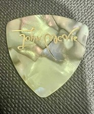
Authentic Touring Fleetwood Mac John McVie Vintage Tour Guitar Pick
$116.00


 Threaded Mode