
| |
|
|
|
#1
 02-12-2013, 11:04 PM
|
||||
|
||||

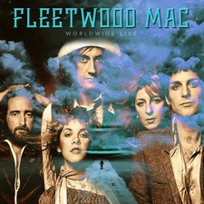
The photoshopping is laughable.
It's also not spaced very well - everything is crowded to the right, and there's that random empty left corner.
__________________

|
| . |
|
#2
02-13-2013, 12:49 AM
|
|||
|
|||
|
And what? They just threw in a setting sun for kicks?
They used this picture to promote the tour. I remember taking this full page FM ad out of my newspaper (back when I still got a paper newspaper) and saving it, but I wasn't happy about the photo. Michele
|
|
#3
02-13-2013, 12:58 AM
|
|||
|
|||
|
I like it, it seems fitting and realistic (albeit the giant Stevie) just glimpses of the band in action...makes sense.
Yeah, I can see why the dispreportioning of members would irratate some, and the rising/setting sun. Never really noticed/thought about sun until now.
|
|
#5
02-13-2013, 04:30 PM
|
|||
|
|||
|
Quote:
__________________
-- Mark --
|
|
#6
02-13-2013, 05:00 PM
|
|||
|
|||
|
It's pretty poorly pieced together if you ask me, it is a live album though so i'll cut 'em some slack.
__________________
 Music gives you the strength to keep moving. Music inspires you. Inspired people don't stay down. Music gives you the strength to keep moving. Music inspires you. Inspired people don't stay down.-Stevie Nicks
|
|
#7
02-13-2013, 08:47 PM
|
||||
|
||||
|
Not a fan of this album cover. I never liked the giant "Cousin It" Stevie.
|
|
#8
02-13-2013, 10:24 PM
|
|||
|
|||
|
Today, I passed the Staples center and they had Fleetwood Mac on the Billboard for this summer. They used the same band photo from the SYW tour. I guess the members have decided they want SYW photos etched on their graves.
Anyway, it was good to see that towering picture of them as I passed, but then when the Billboard image changed, it was Taylor Swift and she will be playing Staples for four dates in August. So, I felt jealous and a little sad. Michele
|
|
#9
02-13-2013, 10:34 PM
|
|||
|
|||
|
I would imagine the proportions of the pics of the various members were not accidental but very carefully negotiated by managers. It establishes Stevie's dominance/prominence/drawing power. Lindsey seems far too diminished however. And really, the two guys whose NAMES are the band's name are teeny.
|
|
#10
02-22-2013, 02:59 PM
|
||||
|
||||
|
Quote:
I agree with the comments made by other Ledgies. The design quality is at the level of a high-school amateur or Chris Nicks. The disparate proportions of the band members is a huge graphic flaw. It's just a thrown together mess. I don't understand why a band of their stature puts out product that is so visually inferior. Their tour programs (along with Stevie's solo tour programs) are also really embarrassingly bad. I see so many other artists who give much more care and attention to their packaging, with really beautifully inspired and innovative, professional quality graphics. It's a huge shame that they (Fleetwood Mac/Stevie/Lindsey) seem totally clueless and careless about that. They just defer to talentless hacks. Any number of Ledgies here could produce exceptional and stunning designs, and we'd do it for free!
__________________
Life passes before me like an unknown circumstance Last edited by PenguinHead; 02-22-2013 at 03:11 PM..
|
|
#11
02-13-2013, 04:25 PM
|
||||
|
||||
 True...
Quote:
__________________
"To acknowledge death is to accept freedom and responsibility."
|
|
#12
02-13-2013, 04:41 PM
|
||||
|
||||
|
Quote:
Did they actually pay someone to do this?
__________________
|
|
#13
02-13-2013, 04:50 PM
|
||||
|
||||
 Hell...
Quote:
Knowing Mick, he payed someone half a quadrillion dollars in Monopoly money for the artwork used 
__________________
"To acknowledge death is to accept freedom and responsibility."
|
 |
| Thread Tools | |
| Display Modes | |
|
|

Fleetwood Mac – The Very Best Of Fleetwood Mac 2 CD Set - NEW
$17.40

*VG* Fleetwood Mac - Kiln House RS6402 T1 First Pressing With Insert
$42.00

Fleetwood Mac Rumours,1977 1st Warner Bros BSK-3010 W/Insert VG+
$27.96

Fleetwood Mac – Tusk Sealed 2 x Vinyl, LP Oct 17, 1979 Made in Germany Pop Rock
$35.00
Fleetwood Mac - Worldwide Live 10 CD Box Set - NEW
$35.99


 Hybrid Mode
