
| |
|
#1
 09-16-2011, 01:41 AM
|
||||
|
||||
 The graphic design of Seeds We Sow
Though the general design isn't bad, there is something that really bothers me. The shade of red chosen for the titles is so wrong. It's too garishly bright, making it hard to read, especially the song titles on the backside.
Also, the odd placement of the album title on the front cover is really bad. It's very amaturish, and again, hard to read. There is absolutely no impact to it. On the good side, I like how the lyrics are presented. I'm a big stickler when it comes to lyric layout. The staggered placement of the verses is graphically interesting and makes it easy to read. Also, a big hurray for keeping it simple. For example, the song Seeds We Sow; he rightfully omitted "tat tat tat." That's an inflection -- not a lyric! The same goes for an "Ahh," "Ohh," or any vocal that isn't a word. And don't get me started about eplipses................. I can understand how that would be important if someone is performing the song and wants to recreate the original vocal rendering. But otherwise, purely to read the lyrics, it's completely unneccesary, as is repeating the same chorus or verse several times over. Stevie's presented lyrics are horrible. I want to strangle the graphic designer who layed out the lyrics for her latest album, but that's another story. I know most people may not understand, be aware, or even give a **** about these things. I guess that because of my profession, I'm more sensitive to how poorly and inconsistent these things are to my eyes. Believe me, it could be much better in more competent hands.
__________________
Life passes before me like an unknown circumstance Last edited by PenguinHead; 09-16-2011 at 01:52 AM.. 
|
| . |
|
|

![Peter Green - In The Skies - Expanded Edition [New CD] Bonus Tracks, Expanded Ve picture](/vintage/img/g/W7IAAeSwD9tpHhmo/s-l225/Peter-Green-In-The-Skies-Expanded-Edition-New-CD-B.jpg)
Peter Green - In The Skies - Expanded Edition [New CD] Bonus Tracks, Expanded Ve
$17.10
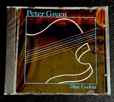
CD Peter Green Blue Guitar Castle Communications 1991 Rock Blues
$24.99
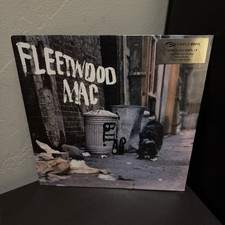
Fleetwood Mac - Peter Green’s Fleetwood Mac Simply Vinyl S125032 UK 2005 SEALED
$49.99

A Green Peace? Environmental & Military Foreign Policy, Peter Jacques HC 2003
$34.00
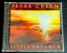
Peter Green Little Dreamer CD 1991 Castle CHC 7016 NEW SEALED Fleetwood Mac
$24.99


 Threaded Mode