
| |
|
#1
 08-19-2015, 10:08 PM
|
||||
|
||||
|
Something I thought would be pretty fun, rank Stevie's album covers from worst to best.
8) Street Angel  It's bottom of my list just because... it's simply hideous. It's SO BLAND. The typography is vile and all the pink just completely washes Stevie out. In my opinion, it's the only TRULY awful Stevie album cover. She normally nails them. 7) The Other Side Of The Mirror  Oh such a good album cover... spoiled by such terrible hair and that awkward pose. I love the colours and the concepts, but it's a little too 80s for me. I recognise that it's awesome, but the others are better. 6) Rock A Little  Such a great image, so classic Stevie. What terrible typography. If it had nicer typography (I'm big on typography...) it would probably be in my top three. I hate having to squint to read the "Rock A Little" part. 5) In Your Dreams 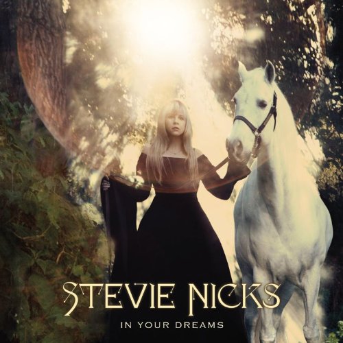 I said this when it came out, I'll say it again now. THAT. BLOODY. BUBBLE. It ruins the whole thing for me. If it wasn't for that bubble, this would be #1 for me, no question. It just irritates the life out of me. Gorgeous colours, gorgeous typography, simply lovely. 4) Trouble In Shangri-La  Gorgeous colours, gorgeous typography, so refreshingly epic after the nightmare that is Street Angel. Where SA feels bland and boring, TISL feels vibrant and crisp. Shame about the thong thing... Ruins the almost-perfect Stevie image. 3) The Wild Heart 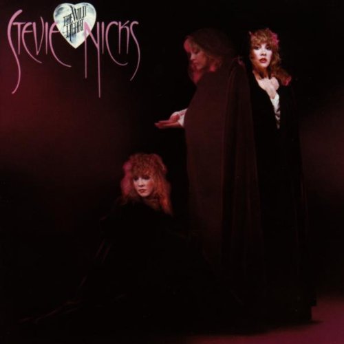 Gorgeous, gorgeous, gorgeous. Simply adore this cover. The colours are just stunning, the typography (although I have issues with "The Wild Heart" inside a heart thing...) I love the three Stevie images, they're just perfect. As a History teacher, I wonder if she was inspired by the portrait of Charles I which shows him three times. Probably not, but I love the idea. 2) 24 Karat Gold 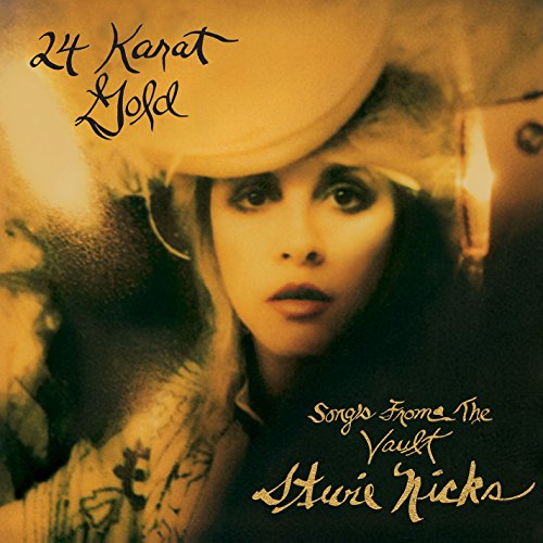 Oh, how I ADORE this album cover. I have the vinyl on my bedroom wall and many a person has commented on how striking they find it. It's so effective, and she chose a simply gorgeous image of herself to use as well. The typography is excellently placed and simply gorgeous. 1) Bella Donna  Cliché I know, but whatever. It remains her best album and best album cover. The colours, the dress, the typography, the simplicity, the parrot! It's all stunning. I cannot fault it at all.
__________________
 
|
| . |
|
#3
08-20-2015, 03:49 AM
|
|||
|
|||
|
Quote:
I like your list. I'd probably put Wild Heart at the top of mine. The thong thing I'd never noticed before. And I have to say that I can't imagine a post '85 Stevie wearing them. Unless she had layers and layers of granny panties underneath. That was an awkward pose for the mirror.
|
|
#4
08-20-2015, 10:46 AM
|
||||
|
||||
|
Well, most of our answers to this question came from THIS thread from a little over a year ago...
http://www.ledge.fleetwoodmac.net/sh...k+album+covers Perhaps the moderators can merge these?
|
|
#5
08-20-2015, 11:50 AM
|
|||
|
|||
|
Stevie's album covers have always been, compared to others, pretty damn good but there are two which REALLY stand out for me and are iconic and those are Bella Donna and Rock a Little. I have the RAL album cover on my wall in my bedroom and I just love looking at it. The amazing shape of her outfit and the stark contrast between the black outfit and white background, amazing.
I also LOVE the Trouble in Shangri-La cover, just fantastic, and also I think the TOSOTM album cover is great too and I love the red against black. This time last year when the 24KG cover was released I was so excited and thought it looked great. It still does, especially on vinyl. The only ones that don't stand out for me are Street Angel and In Your Dreams. Overall though her covers are fantastic. If there were Grammy's for best album covers then she would've won a couple of times IMO.
|
|
#6
08-20-2015, 11:58 AM
|
||||
|
||||
|
Quote:
I'm not much of a fan of that album cover either and agree with what somebody said on another thread that maybe they should have gone with the "Secret Love" cover photo or even the DVD documentary photo of her wearing the top hat superimposed over the spiral staircase in her home. After all, a huge bulk of the project WAS recorded there.
|
|
#7
08-20-2015, 03:43 PM
|
||||
|
||||
|
Since this thread is generally about Stevie's album covers I want to count all of them:
11) 1998 – The Enchanted Works of Stevie Nicks  Just one word: lazy. I like minimalism but seriously, does this looks like the summary of a majestic music career? Even if it's a greatest hits they should have at least put some effort in it. 10) 2007 – Crystal Visions - The Very Best of Stevie Nicks  Now this is more like it. Simple but not simplistic. Some beautiful pictures of a beautiful Stevie from a beautiful photoshoot. Simple, nice and delicate style for the font, that reminds me a bit of art nouveau. But that's about all. 9) The Other Side of the Mirror  What happened to her face? And to her arms? The concept and the colors are beautiful but everything has been ruined by the gross editing on her appearance, that in my opinion was really unnecessary to begin with but turned out damaging. For all this reasons added to the one that the pose is a bit predictable, I've always thought that the back picture would have been an amazing cover for this album instead. 8) Timespace - The Best of Stevie Nicks  This is actually nice even if it's nothing special. I love Stevie with darker hair and the vivid and higly saturated colors are very Pop-Art/Andy Wharol style. 7) Street Angel  Again I think that this is actually nice. Simple, minimalist and refined in its light colors, it fits well with the down-to-earth nature of this album. Actually the picture is better than the album itself. 6) In Your Dreams  This cover is very pretty. You can see that it's been thought and there's a sort of concept behind it; Stevie's vintage gown, the white horse, the forest, the light filtering through the foliage: indeed everything looks "dreamy". The only thing that bugs me is that the editing of the foto looks a bit unnatural. 5) Rock a Little  Again with the vintage allure, but this time it worked magnificently. The high contrast Black-White-Red color scheme resembles the one of The Other Side of the Mirror but here the colors are more pure and regal, and the contrasts are essential. 4) Trouble in Shangri-La  This cover is beautiful. The colors are honeyed, like veiled by a suffused gold light and the image of Stevie against the ocean is evocative. The oriental details reminding of the album title looks like they are finely watercoloured. This truly looks like a triumphant comeback. 3) 24 Karat Gold: Songs from the Vault  Everything I've said for Trouble in Shangri-La can be said for this album cover too. The colors are subdued, soft and golden. Stevie is gorgeus. It's mystical, retrò, peculiar. I've been delighted to find out that she had this hidden talent for photography and this cover is the proof. 2) The Wild Heart  This cover use such a strong imagery that seems to jump right out from the subconscious. While the images are amazing and dreamlike, the colors are intense, sumptuous, rich of mysterious shadows. 1) Bella Donna If I had to describe this cover with just one word, it would be simply "iconic". The colors are fine, ethereal and delicate, emphasized by the stark contrast with the darkness of the background, and Stevie is the image of daintiness and femininity. It represents perfectly the statement: "Come in out of the darkness". Last edited by SisterNightroad; 08-20-2015 at 03:53 PM..
|
|
#8
08-20-2015, 06:45 PM
|
||||
|
||||
|
Wow this is a tough one. I think they are all good but the way the words Stevie Nicks is written on the cover makes an impact just as much as the photo. I LOVE the Wild Heart Photo and words the way they are dripping down with a moon heart in between. Just too cool for words. Bella Donna is awesome too. But the back cover makes me like it more. The close up of Stevie's dark and mysterious eyes looking through a tambourine is just draw dropping IMHO. I don't care for the way the words Stevie Nicks is written on RAL. I also don't care for the picture. But it does stand out to be her only album where she is almost smiling LOL. I guess that is another reason I don't care for it. Stevie has always been mysterious to me and that photo and look just does not fit her persona. Trouble is a great album with just her back. I love Street Angel too the way she is looking down. Great job there! The others are just meh to me

__________________
 My heart will rise up with the morning sun and the hurt I feel will simply melt away My heart will rise up with the morning sun and the hurt I feel will simply melt away
|
|
#9
08-20-2015, 08:02 PM
|
|||
|
|||
|
Quote:
Wild Heart is #1 for me, I think. Michele
|
|
#10
08-20-2015, 09:14 PM
|
|||
|
|||
|
Both Street Angel and Enchanted look like someone got a hold of Adobe Illustrator and said "hey! I can be a designer!". Then they proceeded to get some stock fonts, used a couple filters and imported a scan of a generic CDROM feather JPG.
 "The Bubble" or lense flair or whatever it is, is what we used to call "retarded" back before it was not ok to say "retarded". like "omg. that is SO retarded".  The best ones are Wild Heat, Bella Donna. They are iconic.
|
|
#11
08-20-2015, 10:45 PM
|
||||
|
||||
|
Quote:
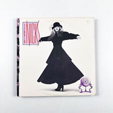
We can blame Stevie's 'talented' ") brother Chris Nicks for these 2 covers. He was also responsible for designing some atrocious tour books and tour shirts! brother Chris Nicks for these 2 covers. He was also responsible for designing some atrocious tour books and tour shirts!
|
|
#13
08-20-2015, 10:52 PM
|
||||
|
||||
|
Quote:
Quote:
|
|
#14
08-20-2015, 11:25 PM
|
||||
|
||||
|
Quote:
One of worst things Chris Nicks designed was a 'Street Angel' tour shirt. He literally photocopied the CD cover (including the surrounding jewel case!) and had that printed on the shirt. WTF?!  And not to forget - the unintentionally hilarious 'Lucky Charms' rainbow and pot of gold design that he did for one of Stevie's tours. 
|
|
#15
08-20-2015, 11:43 PM
|
|||
|
|||
|
Quote:
__________________

|
 |
|
|


Fleetwood Mac RUMOURS (Stevie Nicks) Platinum Award + Photo of Group
$169.00
Stevie Nicks - Rock A Little - Vinyl LP Record - 1985
$36.00
Stevie Nicks T Shirt - Thunder only happens when it's raining - stand back
$24.00

Stevie Nicks 2024 Live In Concert Shirt,Vintage Stevie Nicks Concert Merch Shirt
$33.99
FLEETWOOD MAC STEVIE NICKS COLLAGE POSTER 24x36 NEW
$14.99


 Linear Mode

